
Much like an ident, a logo is essential to having a successful brand. It is what attracts us to a brand and what makes it memorable. Here I’ll be looking at various Logos and finding out why they’re so effective. I’ll be looking at logos from clothing lines to TV shows and production companies to get a broader understanding and not just base my research on one medium. I’ll then be attempting to form my own logo based on the name of my brand. I’m hoping this process will help me figure out what would work well with my films.
Typography
Typography is a key component in making a logo or a name memorable. I’ll be looking at a few examples of memorable typography in TV, Film and other consumer platforms.
Star Wars
![]()
Star Wars is undoubtedly one of the most iconic film franchises ever spanning over 40 years. This font is synonymous with the franchise, so much so that using this font in any circumstance will make an audience correlate something unrelated to the franchise.
Here is a clear example, I’ve used the name of my production company name and then used an imitation of the font from an online generator to create this. Even though this doesn’t look like the logo above it does hold a lot of resemblance with the Star Wars font.
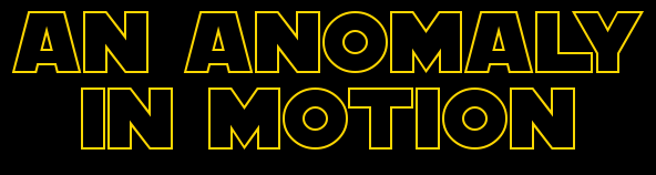
I was not aware of the history in this logo until’ watching this video. The official logo was drawn partly by Suzy Rice and then later on altered and refined by Joe Johnston. The logo had many variations with one of the characters in the logo, a basic Helvetica font and finally the logo we all know today.
Stranger Things
![]()
When it comes to paying homage to the 80’s Stranger Things does it best, some may say it’s cloud of nostalgia is better than most of the films and books they’re paying tribute to. The infamous typeface has been used countless times on the covers of Stephen King novels, sci-fi film opening credits and choose your own ending books. The typography fits well with the time period because of this. Much like Star Wars, this typeface is now synonymous with the show. When this font is used in any other context almost anyone can make a connection to the show.
I found an online text generator that was made to promote the show so I used it to write out my full name. I would have written my company name but it’s more than two words long.

Watching this video helped me learn about the history of the logo and the transformations it went through before settling on the above image.
Nike
Nike is one of the most recognizable brands in the world, primarily due to the Nike tick or “swoosh”.
![]()
The simplicity of the logo that appears on almost every piece of apparel is quite basic and uninspired in my personal opinion seeing as the price range for their apparel is quite high. However, you could bring up the argument that they value quality over their image.
This was made by a university student who wanted to make a quick buck but didn’t get all the rights to it as she had not envisioned Nike becoming as big as it is. She was given shares after a couple years when Nike had found its feet.
Researching these logos has really helped me understand the work it takes to perfect a logo. I may have to go through multiple design changes to get the most effective logo that it enticing and memorable… and also may look good on a shirt.
